Mastering Kadence Blocks Responsive Design: Making Kadence Blocks Responsive
Have you ever run into difficulty making Kadence Blocks responsive across multiple device sizes? Creating responsive designs with Kadence Blocks can seem daunting, but with the right techniques, it becomes manageable. This guide will walk you through essential methods to ensure your Kadence Blocks are responsive across various devices, including using HTML line breaks and managing padding effectively.
Table of Contents
- Introduction to Kadence Blocks Responsive Design
- Using the Advanced Heading Block
- Responsive Testing with Polypane
- Custom Media Queries and CSS Techniques
- Setting Max Width for Row Blocks
- Using Padding in Columns
- Understanding Percentage Units for Responsive Design
- Troubleshooting Common Issues
- Implementing Line Breaks for Better Text Control
- FAQs about Kadence Blocks Responsive Design
How to Make Kadence Blocks Responsive
Introduction to Kadence Blocks Responsive Design
Kadence Blocks Responsive design is essential for creating visually appealing and functional websites. Understanding how to manipulate elements within Kadence Blocks ensures that your content looks great on all devices, from desktops to mobile phones. This section will introduce the fundamental concepts of responsive design and how Kadence Blocks facilitate this process.
Understanding Responsive Design
Responsive design entails creating web pages that adapt smoothly to various screen sizes and orientations. This adaptability enhances user experience and accessibility, ensuring that content is easily readable and navigable on any device.
- Fluid Grids: Utilizing percentage-based widths allows elements to resize according to the screen size.
- Flexible Images: Images that scale within their containing elements prevent overflow and distortion.
- Media Queries: Custom styles can be applied based on device characteristics, allowing tailored layouts for different screens.
Using the Advanced Heading Block
The Advanced Heading Block in Kadence Blocks offers enhanced customization for text elements. This block is ideal for creating responsive headings that adjust based on screen size, ensuring optimal readability.
Key Features of the Advanced Heading Block
- HTML Editing: Users can switch to HTML mode for precise control over text formatting and line breaks.
- Customizable Styles: Adjust font size, color, and weight to maintain visual hierarchy across devices.
- Responsive Controls: Set different styles for desktop, tablet, and mobile to ensure consistency.
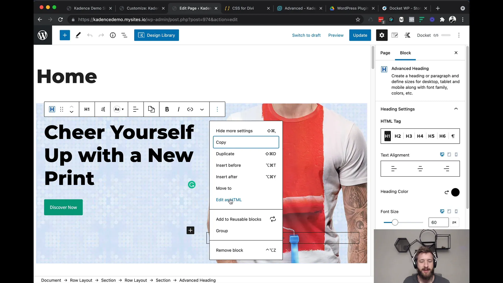
Implementing Line Breaks
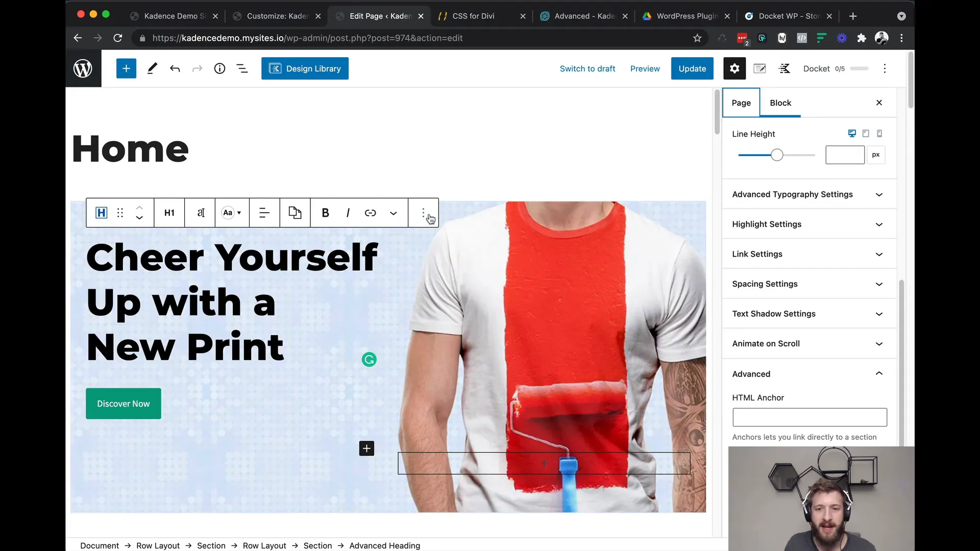
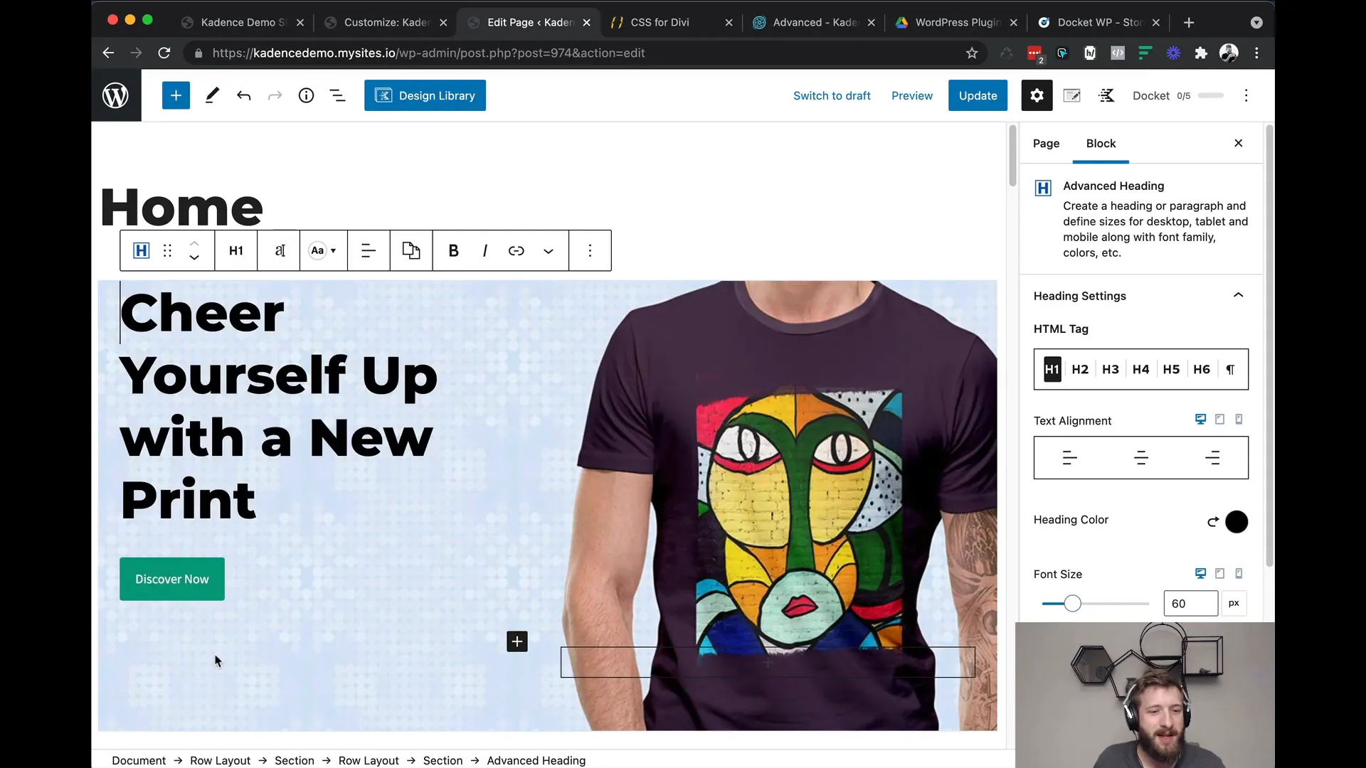
To control text layout, inserting line breaks can significantly improve the appearance of headings. This is particularly useful when you want to ensure specific words or phrases appear on separate lines.
For example, using the line break tag (<br>) allows you to force a break at a designated point, enhancing the visual flow of your content.
Responsive Testing with Polypane
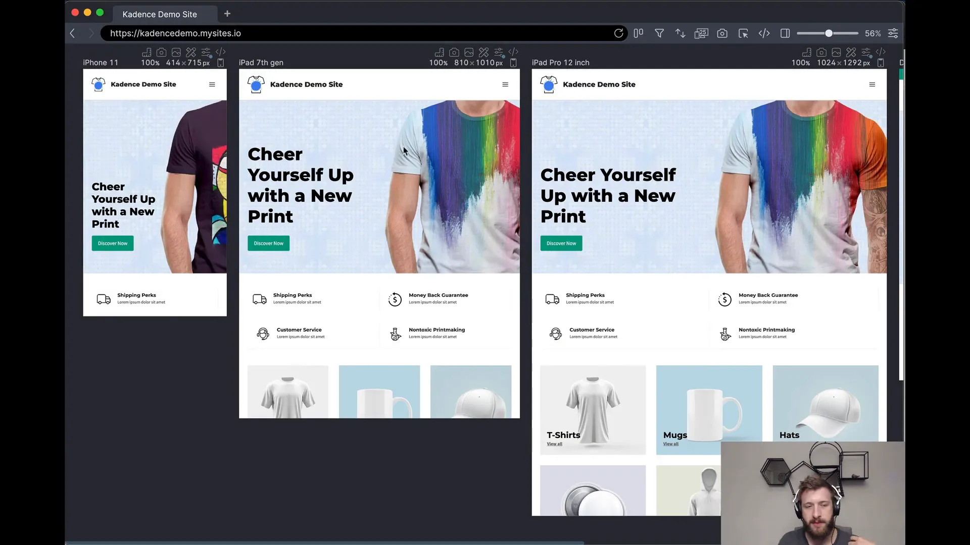
Testing responsiveness is crucial to ensure that your design performs well across all devices. Polypane is a powerful tool that allows you to preview your web pages in multiple viewports simultaneously.
Using Polypane for Effective Testing
- Multi-Viewport Display: View your site on different devices side by side, making it easier to identify layout issues.
- Dynamic Resizing: Adjust the size of the viewports to test how elements respond to various dimensions.
- Scroll Synchronization: Scrolling in one viewport automatically scrolls the others, allowing for comprehensive testing of interactions across multiple device sizes, simultaneously.

Custom Media Queries and CSS Techniques
While Kadence Blocks provides built-in responsive features, custom media queries can enhance control over your design. This involves writing CSS rules that apply styles based on specific screen sizes or orientations.
Creating Custom Media Queries
To create a custom media query, use the following syntax:
@media (max-width: 768px) {
/* CSS rules here */
}
This example targets devices with a maximum width of 768 pixels, commonly used for tablets and mobile phones.
Utilizing custom media queries allows you to:
- Modify font sizes for better readability on smaller screens.
- Change layout structures, such as switching from a multi-column layout to a single column.
- Hide or display elements based on screen size, optimizing user experience.
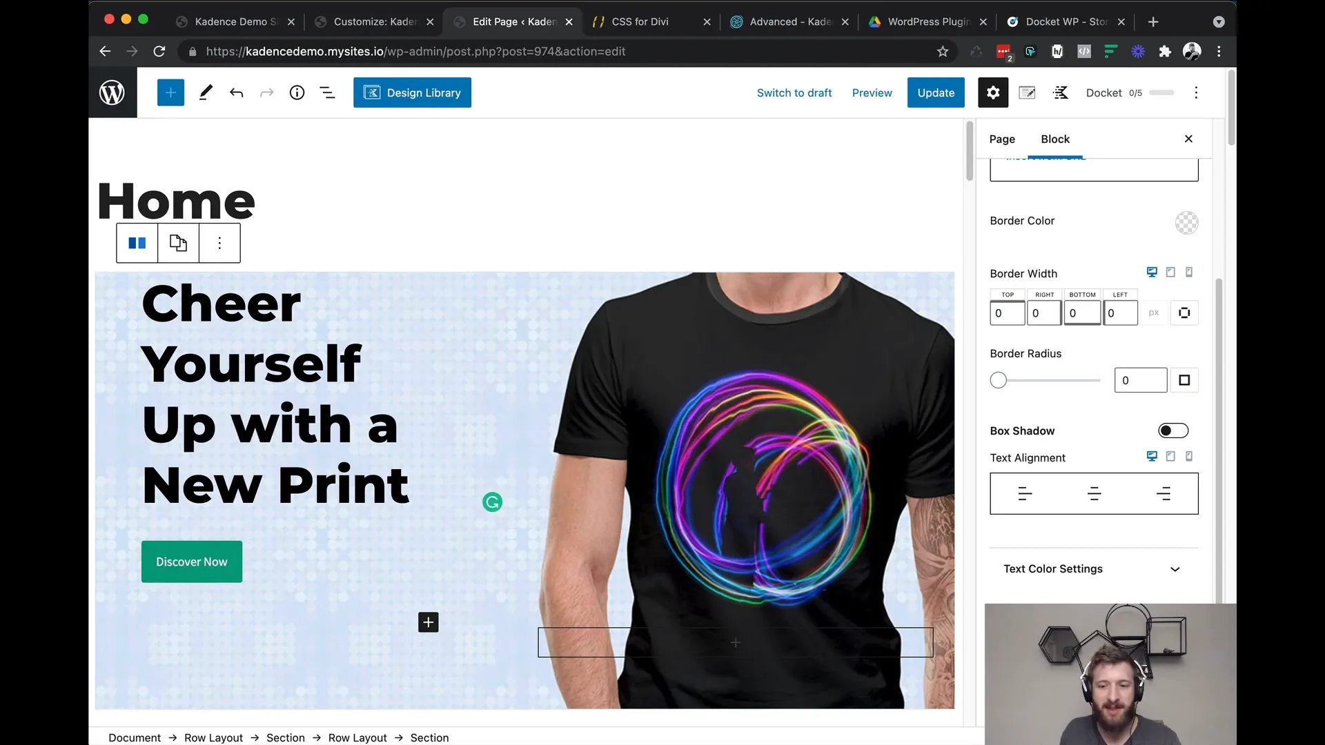
Setting Max Width for Row Blocks
Managing the width of content within row blocks is critical for maintaining a clean and organized layout. Setting a maximum width ensures that content does not stretch excessively on larger screens, enhancing readability.
How to Set Max Width
In Kadence Blocks, you can set the max width for row blocks directly in the block settings:
- Navigate to the Row Block settings.
- Locate the Structure settings.
- Enter a pixel value for the max width, ensuring it fits your design needs.
This method allows you to keep content contained and visually appealing regardless of the screen size.
By effectively utilizing these techniques, you can master Kadence Blocks Responsive design. Each element, from text manipulation to testing and custom styles, contributes to a cohesive and appealing web experience.
Using Padding in Columns
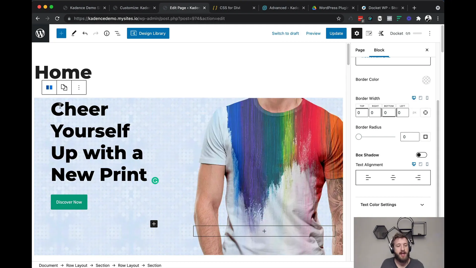
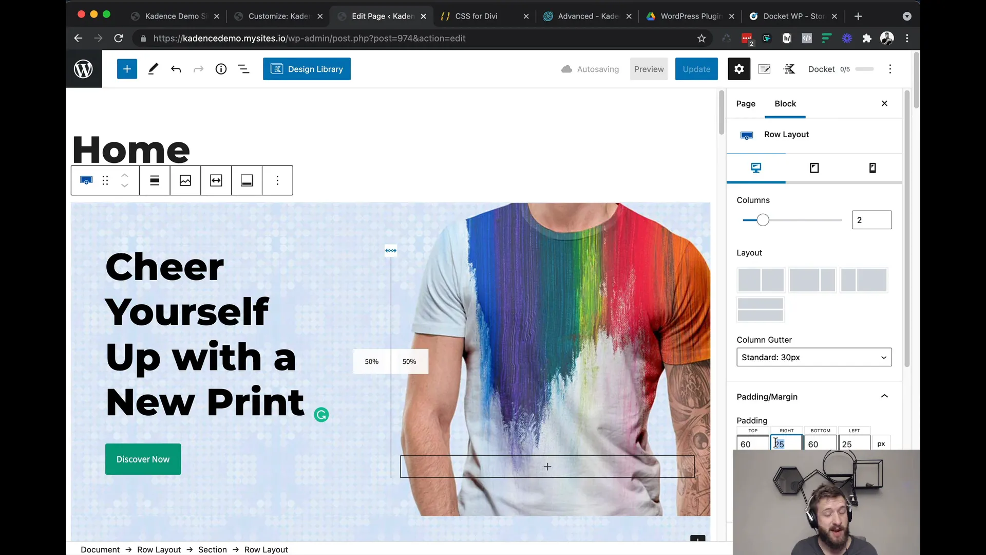
When working with Kadence Blocks, managing padding effectively is crucial for achieving a polished look. Instead of applying padding to the row block, focus on the individual column settings. This method allows for greater flexibility and ensures that your design remains responsive.
To apply padding in a column:
- Navigate to the column settings in your Row Block.
- Set your desired padding values for top, bottom, left, and right.
- Utilize percentage units for left and right padding to maintain responsiveness across devices.
By doing this, you can ensure that the padding values are inherited across different breakpoints, preventing unexpected layout shifts on mobile or tablet displays.
Understanding Percentage Units for Responsive Design
Using percentage units in your design is a game changer for responsive layouts. Unlike fixed pixel values, percentages allow elements to scale dynamically based on the screen size, making your design more adaptable.
For instance, if you set a width of 50% for a column, it will take up half the available space on any screen size. This ensures that your layout remains consistent and visually appealing, whether viewed on a desktop or mobile device.
Here are some tips for using percentage units:
- Apply percentage widths to columns to create fluid layouts.
- Use percentage padding or margins to maintain spacing that scales with the content.
- Experiment with different percentages to find the right balance for your design.
Troubleshooting Common Issues
Even with the best practices in place, you may encounter issues while designing with Kadence Blocks. Here are some common problems and their solutions:
- Text Overflow: If text is overflowing its container, check the padding and margin settings. Ensure that you are using appropriate units (like percentages) and consider applying the CSS property
overflow-wrap: break-word;to manage long words effectively. - Inconsistent Padding: If padding appears differently across devices, revisit your column settings. Ensure that you are applying padding at the column level rather than the row level to maintain consistency.
- Line Break Issues: If line breaks aren’t appearing as expected, ensure you are using the correct HTML tags. Use
<br>for line breaks and consider using non-breaking spaces for words that should stay together.
Implementing Line Breaks for Better Text Control
To enhance text readability and control layout, implementing line breaks strategically is essential. You can control where text breaks by using the line break tag (<br>) in your HTML.
For example, if you want to ensure that a specific word appears on a new line, simply insert a line break at the desired point. This is particularly useful for headings or promotional text where the visual impact is crucial.
Additionally, consider using non-breaking spaces ( ) to keep certain words together. This is useful for preventing “orphans” or “widows,” where single words fall to a new line by themselves.
FAQs about Kadence Blocks Responsive Design
What are Kadence Blocks Responsive features?
Kadence Blocks Responsive features allow you to create layouts that adapt to various screen sizes. This includes customizable padding, margin settings, and the ability to use percentage units for fluid designs.
How can I ensure my text is responsive?
To ensure text is responsive, utilize the Advanced Heading Block’s settings. You can adjust font sizes and line spacing for different devices, ensuring readability across all screen sizes.
Can I use custom CSS for more control?
Yes, custom CSS can be used to apply specific styles that may not be available directly through the Kadence Blocks interface. This allows for more granular control over your design elements.
How do I test my responsive design?
Using tools like Polypane allows you to preview how your design looks across multiple devices simultaneously. This is essential for identifying layout issues and ensuring consistency in your design.
Made with VideoToBlog
Was hoping you’d address Kadence’s Table (Adv) block which seems to be broken when it comes to responsiveness.
Souldn`t I use any padding at all in a row-block, so only use padding in the sections-block and select %?